How to mod/create a websiteThis tutorial is a bit lengthly but it will cover everything you need to know on how to mod and or create a website using our software/template system. This tutorial requires you to have knowledge on both HTML and CSS. Photoshop skills will also be required as this tutorial will have you create banners and such. It should be mentioned that you should save all of your images for web use. Try to avoid any copy right images (watermark, etc.). Now lets begin. Step Up ProcessStep 1: After going through the site set up process, type into the URL the site address. Here is where we are starting from. As you can see in the example below, not much is going on with this basic, no logo website. 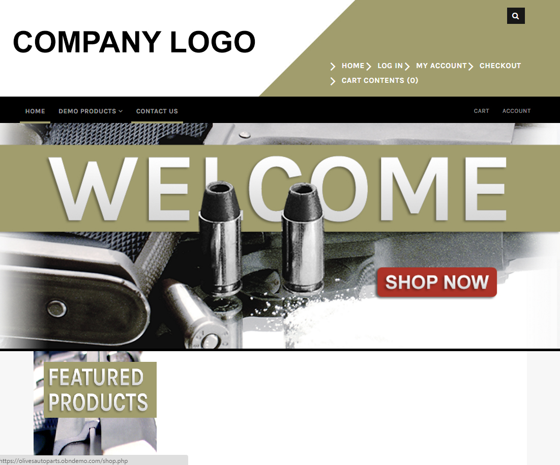
Step 2: Login into the admin. 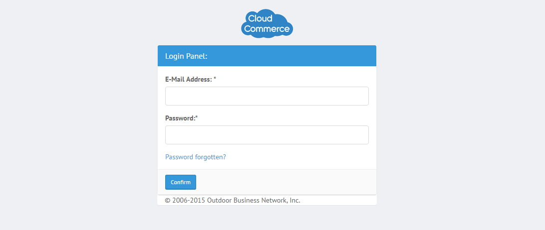
Step 3: On the left, navigate to "Configuration". Scroll down to find "Cache". 
Step 4: We need do make sure the Cache is set to "False". If it is set to "True", hit the blue "Edit" button and set it to "False". 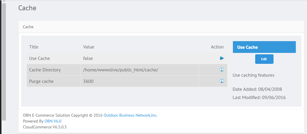
Step 5: From the left menu, navigate to "Info Manger" and scroll down to find "Fill Tags". Follow the steps in the knowledgebase listed below on Fill Tags. Step 6: Now move on to Text Control. Follow the knowledge listed below on Text Control. Step 7: Navigate to "Store Options" from the left navigation menu under "Configuration". Follow the "Store Options" Knowledgebase by clicking the link below: Step 8: Upload your Company Logo. This can all be done by going through the Uploading Admin Logo Knowledge by clicking the link below: Step 9: Moving on to deciding which template we will use for this website. This options can be found in the "Info Manager" option in the navigation menu to your left. Follow these helpful steps in the "Manage Templates" knowledge in the link below: Step 10: These next steps require you to navigate using the left menu down to "Tools". From there, click "File Manager". 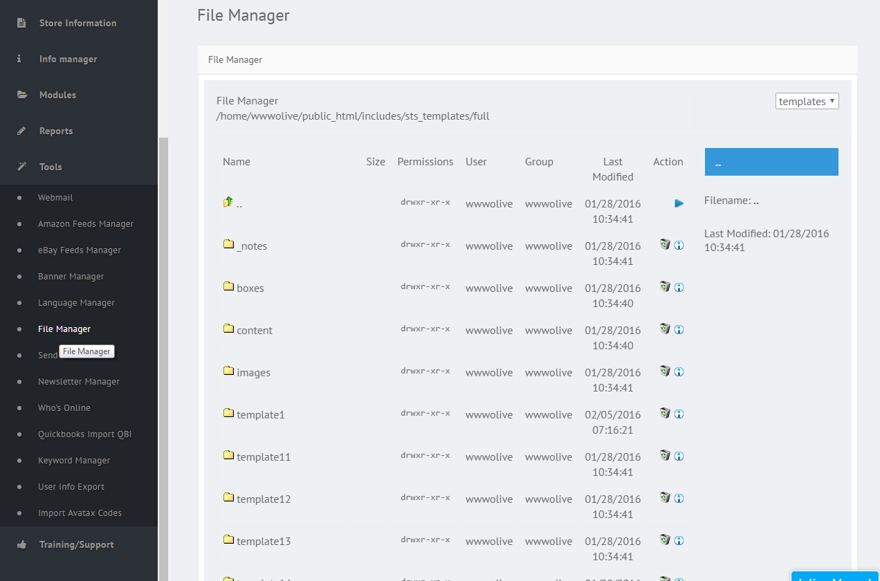
Step 11: Navigate and or search for the following files and update them by replacing the logos then upload them. It is best to use photoshop to get the correct image sizes and make sure each image listed is saved for the web. The images are the following:
Step 12: While still in "File Manager", locate the "Noimage" GIF files. Make sure to change these as well. Step 13: Once again, navigate to "Info Manager" and scroll down to the first option "Information pages". We need to create pages that provide customers information on the business. That can be their mission statements, history and or shipping details. Below is a link on how to create Information Pages: Step 14: Now that you have done the Information Knowledgebase, we can go ahead and create the needed/basic info pages.
Step 15: Get familiar with Front End Categories. A link to a knowledgebase is provided below: Step 16: Make sure Front End Categories are turned on.
End Of The Set Up Process
Alright so now we have the admin part of the website at a good spot. We need to now focus on the design and what the website will start to look like and there is a lot to consider. Color schemes and overall which template will better suit the site. For this example we went with Template 2 as mentioned in the previous steps. It always helps to have a design sketch available to have some sort of idea on which direction to go. Black or White background and of course matching up a strong concept. Lets move on to the Design Process. Design ProcessStep 17: Determine what the color scheme will be. Step 18: Make sure there is a design sketch and a solid concpet or theme to follow. It may help to do a quick mock up in photoshop. See below: 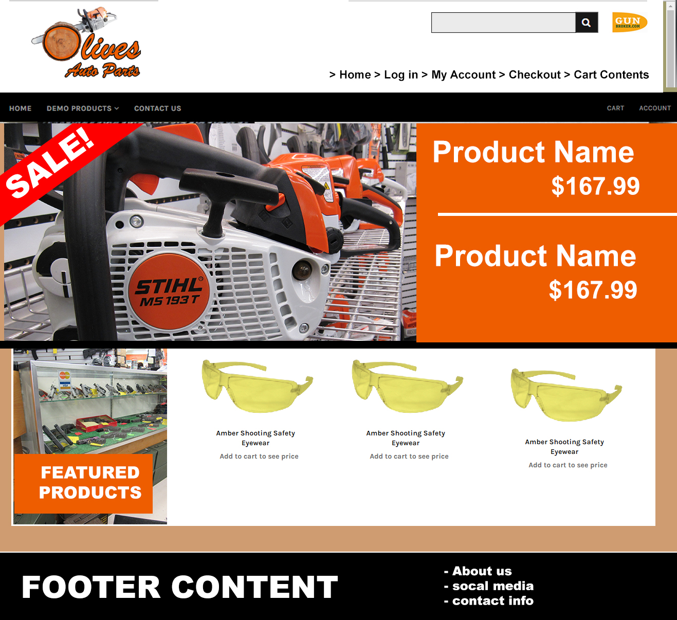
WARNING! MUST KNOW HTML AND CSS AT THIS POINT!!!Step 19: Alright, so from here on out there will be a lot of editing, uploading and downloading if need be so it is VERY helpful to create a back up folder which contains all of the current files of your website incase anything should go wrong you can always revert back to this step. To create a back up, gain access to the FTP through dreamweaver. IF you do not have access to the FTP, feel free to give us a call at 800.699.0820. In most cases, the rest of these steps will be handled by our designers here at Outdoor Business Network.
Designing The HeaderStep 20: We are going to start with the Header. We can divide the website up into several groups, e.i. Header, Slider, Content, and Footer. The Header will be a Div tag near the top of the website. See image below: 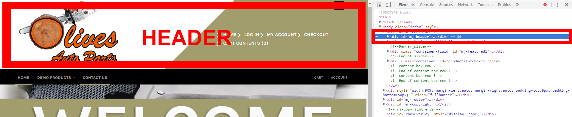
Step 21: Designing the Header is important because a lot of information is usually stored there. The goal with our design is to try and match it up with our mock up. So that means you will most likely being using HTML, Css with Photoshop and Dreameaver if you have access to those programs. All of this can be done through the File Manager as well, just upload and overrite the image once you find it. Step 22: So after going through steps 20 and 21 to locate the Header file and the Css, we can finally delve into the code and change some things. First off, design the header background in photoshop. Don't forget to save it for the web. Upload the newly design header background to override the current header. See example below with the BEFORE and AFTER: 
There is a clear difference between the BEFORE and the AFTER images. Remember, the logo was placed in there in one of the earlier steps but what about the navigation menu? That menu is still there, but because the text is white that navigation will blend in with the white background. No worries, we will get to that. Lets move on to complete the Header with the next step. Step 23: With the header background settled in and looking great! We can now move on to other things like the logo and it's placement. For this knowledgebase, our logo is located inside a Div which is also located in the Header. This Div is named "Logo". The entire tag will look something like this: 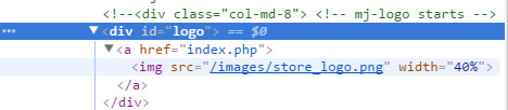
Once you have located that, you can use HTML or CSS to adjust how the logo will look on the website. In this knowledgebase, both HTML and CSS are being used. Remember, if you don't like how the logo looks you can always change that by going back to the Uploading Admin Logo Knowledgebase. Step 24: The Search Icon is in the correct location for this knowledgebase but lets assume it is not in the correct spot for your website. This comes back to Html and CSS. It will be trial and error to find and use the correct Css. Often times, adjusting the Margin-left CSS element or calling to that will fix most of those issues when trying to find the right location. Otherwise, it can require getting into the depth of the code. Do not be afraid to give us a call at 800.699.0820 and we will be happy to assist you if things become too frustrating. As mentioned, if you are not experienced with Html or Css, it is recommended that you avoid this step and the following steps. 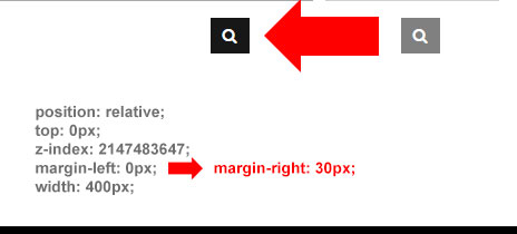
Keep in mind, the Search Icon is a button. When clicked, the search bar appears like it does on the mock up. This should already be set up within Template 2. Step 25: Some template/designs will have you add random elements that don't exactly fit in the grid. This is common in Headers. For this example, we will be adding a third party icon which will be located next to the search bar. For this knowledge base we will be using CSS positioning and have it set to "Relative". If you aren't familiar with how the CSS position element works feel free to open a new tab for Google and type in the search bar "CSS Positioning". 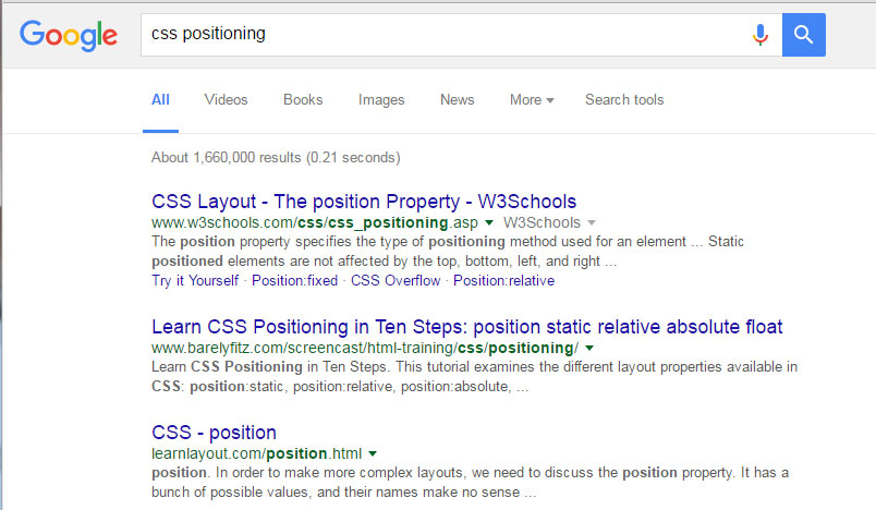
Step 26: Your Header should look similiar to the image below. We want this icon to be responsive and having it set to relative will help with that. Our Header is starting to look closer to what we have shown in the mock up. 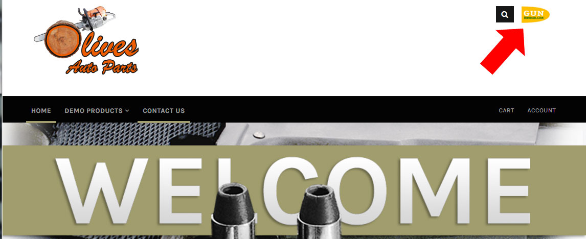
Step 27: Remember, we made the background white knowing the navigation text is also white? This step focuses on changing that. Looking at the mock up, the Header Navigation is suppose to be black. This can be fixed by applying a simple CSS color change to the Css being called to the text of this navigation. 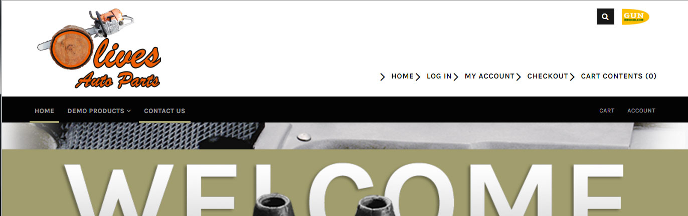
Step 28: With the header now looking how we have it set up in the mock up made earlier, we can mark this complete. Do not worry about testing it in mobile view or on other devices yet since the rest of the design still needs work. Testing the website will be towards the end of this knowledge.
Designing The Navigation MenuStep 29: Locate the Main Navigation Menu. For Template 2 we can see the menu is highlighted in the image below. 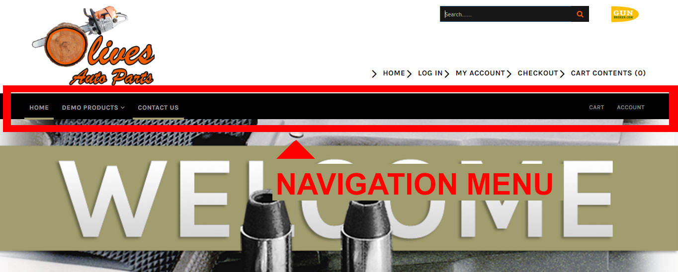
Step 30: To work on the Navigation Menu HTML wise or add an option via HTMl, we need to be in the admin of the website. From there, on the left side, where the navigation is we can see the "Info Manager" option. Click that to see more options, scroll down to "Manage Templates" and click "Edit Templates". 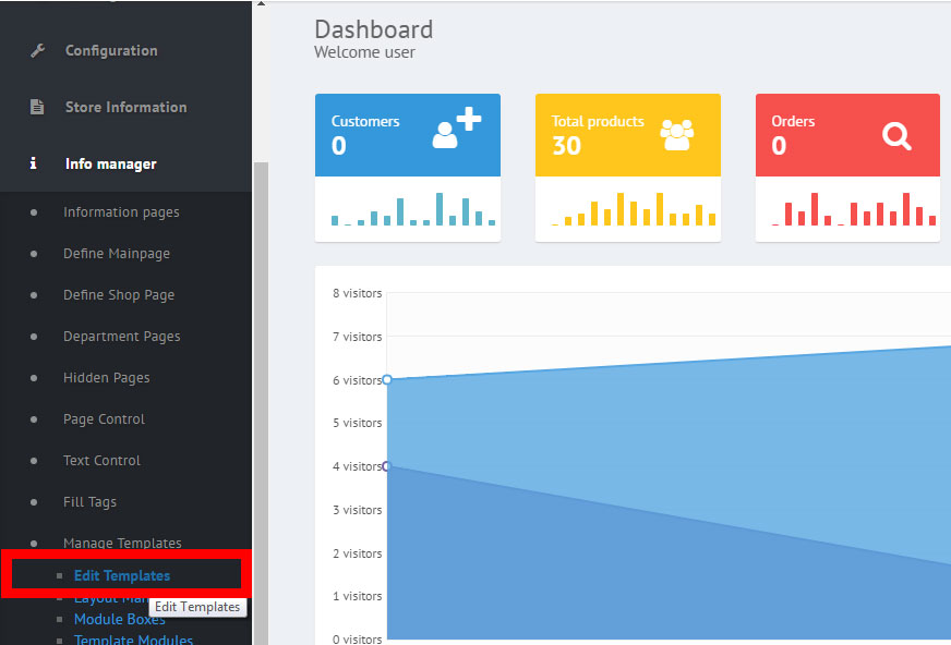
Step 31: You will see a list of different template options. Remember which template you are working on. For this knowledge, we are working in template 2. Click template 2 to see a list of files. Scroll down to "Navigation Menu" as shown in the image below: 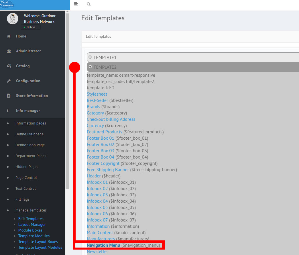
Step 32: After clicking "Navigation Menu", you will see the code behind the Navigation bar. From here you may add any HTML and or Links to the Navigation. 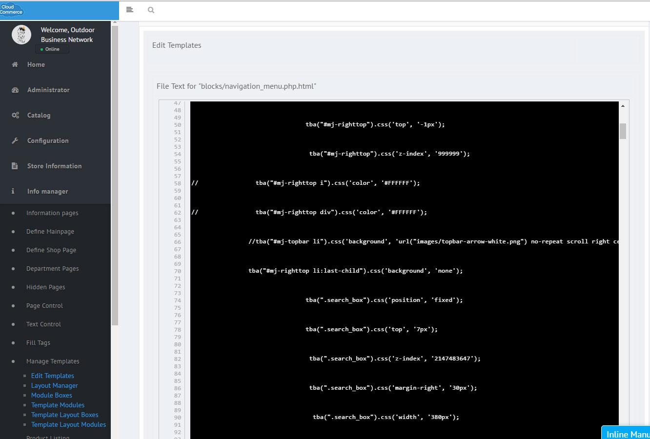
Step 33: Creating or changing the Navigiation Menu will take more than just HTML. You will also need to delve into the CSS. We are going to use CSS to change the color from green to Orange and give it a hover. See image below: (Contact us) 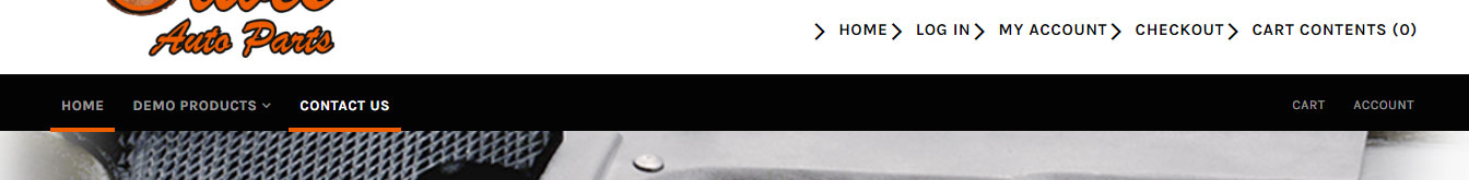
Step 34: When we click "Demo Products", we get a downdrop menu to appear. It's important to make sure the images and everything here looks great because Navigation for your website needs to be as smooth as possible and part of that is not only determined with how it functions but how it looks too. Looks like the colors don't match the color scheme and the gun with bullets doesn't seem to fit the theme either. This needs to be changed. 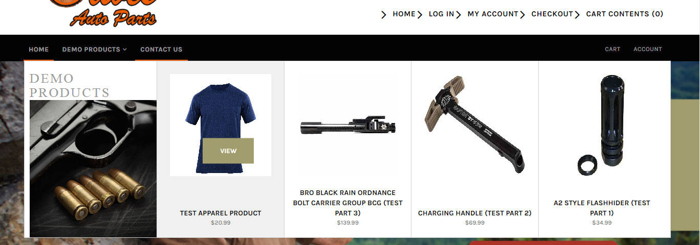
Step 35: First, lets see where the gun and bullet image is being called from. Look at the CSS in the image blow: 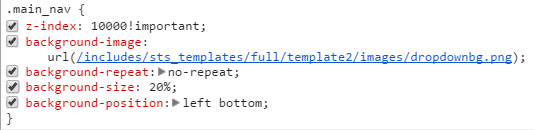
Step 36: Look at the image below to see the change made. The dropdown background image has been changed to better suit the theme of this website. 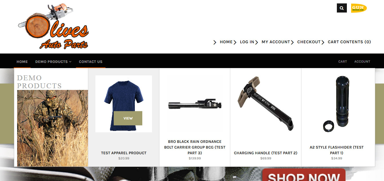
Step 37: Looking at the result of changing that dropdown background image, we can still see that green still shows up for the "View" hover and that it is not part of the color scheme. Using what you know on CSS, you can go into the stylesheet and make some color changes. Step 38: After finding the CSS behind that green color and changing it to the orange, we now have a finished Navigation Menu. 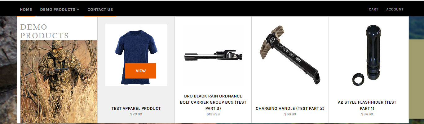
Step 39: It is always a good idea to do a quick test before moving on to the next element of the website to make sure the Navigation Menu is fully functional. This is important because even the slightist hiccup or a roadblock such as a broken link can be frustrating to a customer or anyone who trying to find their way around through your online store. When clicking through, try to see from the customer's point of view. Make changes as needed.
Designing The SliderStep 40: Moving on to the slider! The slider is the scrolling/moving images under the Navigation Menu. In this template, the current Slider reads "Welcome". As great as this slider looks, it sadly doesn't make up to neither the theme or color scheme of this website. It is always recommended to use original content/imagary so we are going to create our own slides and use them for this knowledgebase/website. 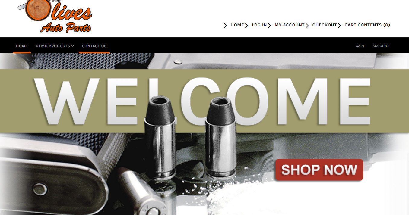
Step 41: With any slider, we need to answer the following questions:
A good first step, look at the code. The code for this slider can be see as the following: 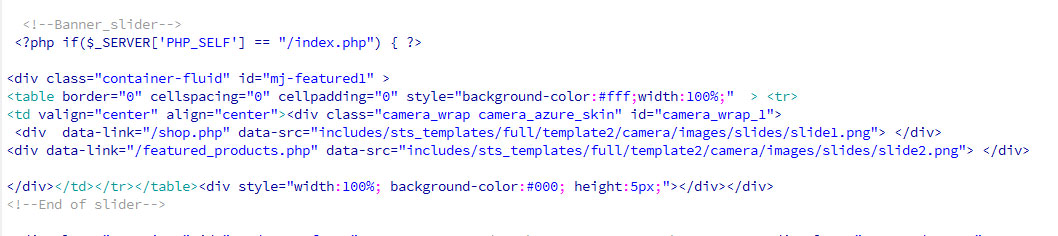
Step 42: Looking at the code, we can see that the two files to work with will be "Slide1" and "Slide2". We also know they are PNG files, so if you upload and link a Jpeg, that will not work. The rest of the code is important too but we don't need to mess with that unless we absolutely need to. Even the slightiest change if done incorrectly can stop the entire function of the slider. So try to avoid any major changes or at least for this knowledgebase step by step. Step 43: Another good practice, looking at the code we can see these sliders are clickable. So in other words, if a customer clicks them, they have links attached to direct the customers to a different page. Because the page we will most likely link these will be different, we can remove those links and replace them with the following "#" until we know exactly which pages we want to link with our slides. This could be a product pages, an information page, or even another site entirely. Regardless, for now these links will be disabled for now. 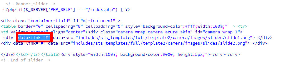
Step 44: Create a photoshop file for these slides if one has been created already then open that file. Do not panic if you can not locate the photoshop. As longas you name the new slides correctly to match the code and link them properly, the new slides will show up. Photoshop is recommended for this step. 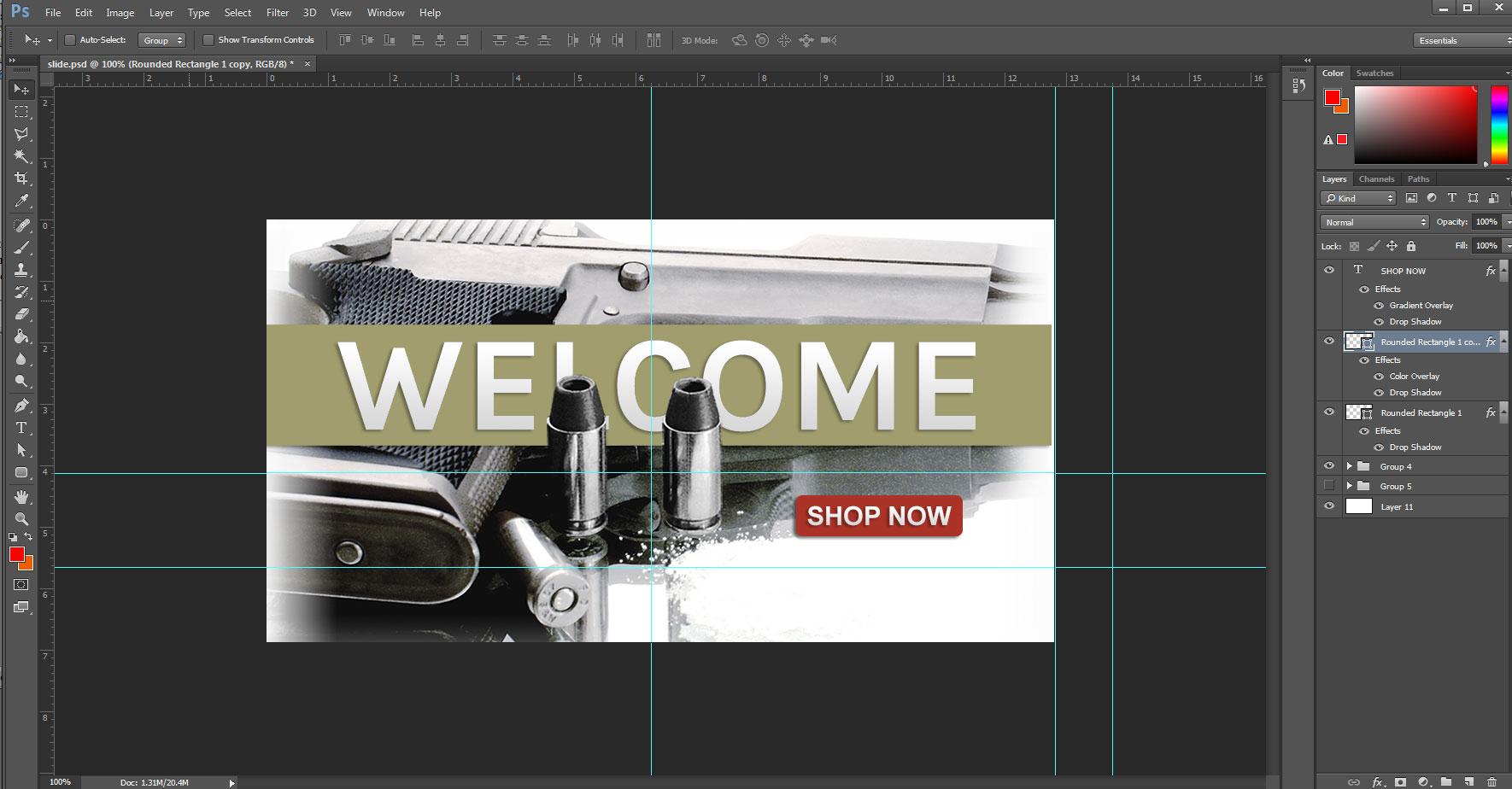
Step 45: From here, we want to create slides that help direct customers to either some featured product or have an informative images about the compnay. Either way, there is a lot of options here that can be explored. Remember to use the same color scheme and apply the same concepts so that the slides match the website. These slides are perfect for putting in "Call To Action" buttons and other useful sales stragety to help direct the customer. For this Knowledge base we will only create two slides but you can add more if you like. Step 46: As you can see below, the first slide is informing the customers of a certain brand/product now being available as a "Call To Action". 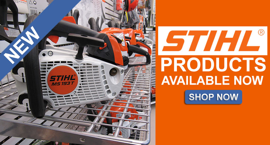
Step 47: For the second slide, we want to focus on another key brand that the website will be providing to customers. Again, we are using the "Shop Now" as the "Call To Action" button while still keeping things pretty clean and simple. The image is a stock photo to give amazing quality and provides a solid focus on the item on display which is the opitc/scope. This sends a clear message on what this slide is highlighting as should all slides. 
Step 48: Upload those two slides to override the current slides. There is also the option to name the slides differently and edit the HTML that we visited as well. Step 49: With the slides uploaded, we can now look back at the website. The cache should be set to "False" which means we can refresh the page and see how our Slider looks now. 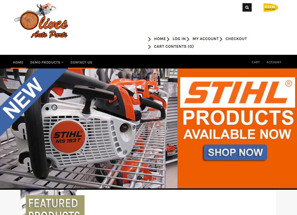
Step 50: Make edits and tweaks as needed. For this, we just want to move the "Call To Action - Shop Now" button a little more centered. 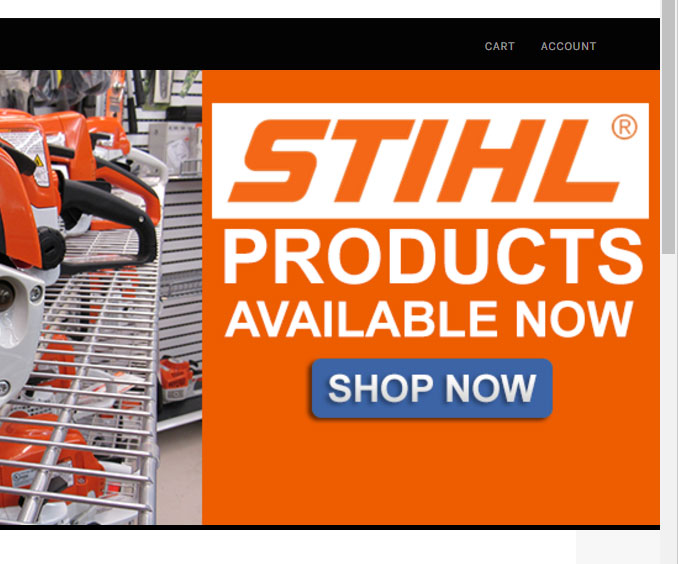
Step 51: Do not forget to link your slides. Return to the HTML code for the slider and make sure fill in the "data-link" so that when customers click the slide, it takes them where they need to go. Setting The Featured ProductsWith the Slider done, we can now move on to the Featured Products. Before we continue, we need to make sure we have at least three products selected for the Featured Products. Step 52: Follow the knowledgebase link below to get famaliar with Featured Products. Featured Products Knowledgebase Step 53: With Featured Products set. 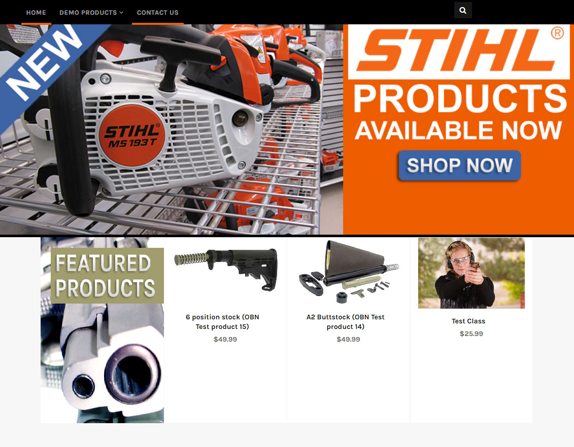
Designing The Featured ProductsStep 54: Much like the Navigation Menu bakcground and the Slides for the Sliders, this current Featured Product image which features a handgun is using the wrong color scheme. So let's investigate the code and see if we can find out what is calling this image. Using "inspect code" with Chrome (Web Browser) we see where the image is being called from. 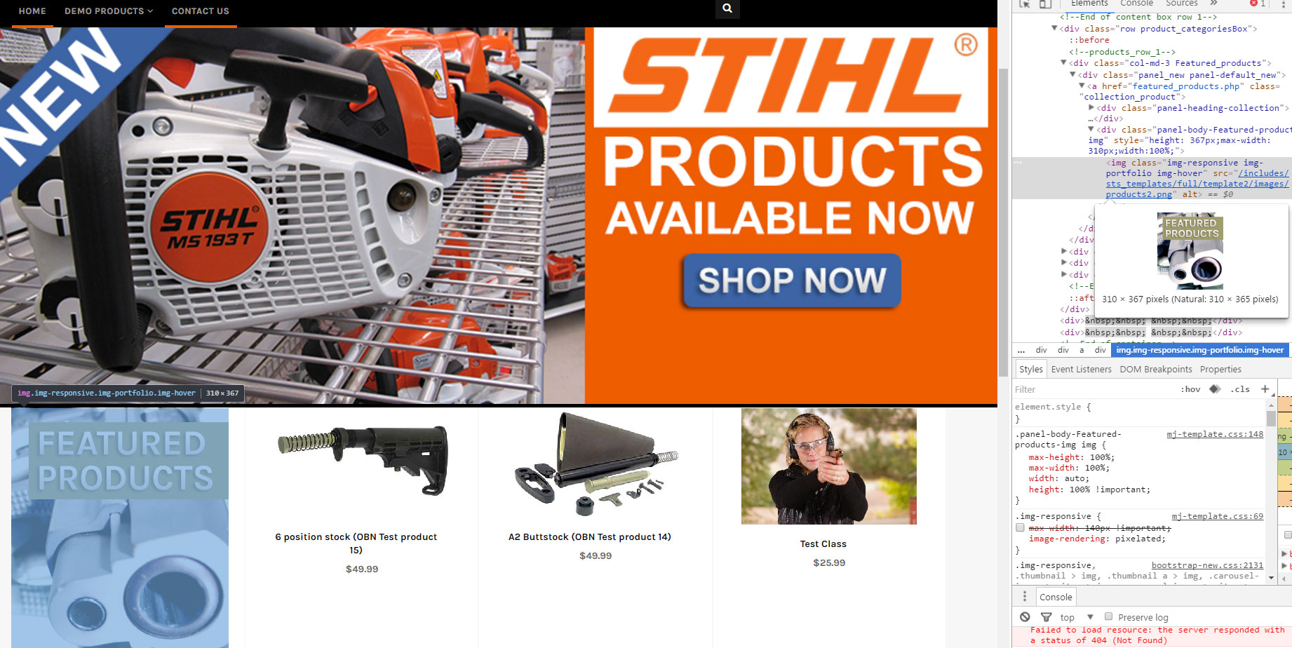
Step 55: Because we will be editing an image, we will need to return to Photoshop if you don't already have it opened. Step 56: Upload and override current image. Feature Products new image: 
Designing Main ContentStep 57: We need to determine what content goes into the Main Content to replace the current Content. The image below shows the current Content that needs to change. This can be done in the Admin of your website by navigating to "Define Mainpage". See Step 58. 
Step 58: Get famaliar with how to add/define your Mainpage. The Mainpage is your HOME page otherwise known as the Index. The Main Content is the content that you put into the "Define Mainpage". The knowledgebase linked below will show you how to add content from the Admin of your Website. Step 59: You can add and or remove any sort of Content from your Mainpage following the knowledgebase in step 58. For this example we will be removing the mission statement. You can keep it or add something along the lines like main "Featured brands" or maybe a banner on if they buy firearms and or any special events going on involving the company/store such as sales and holiday clearances. Step 60: After removing the mission statement, lets add a third box to fill in some space. For this example, all I did was copy the code behind the first box. Keep in mind, you are not limited to what content you want to show here. You can show featured brands and even embed videos. 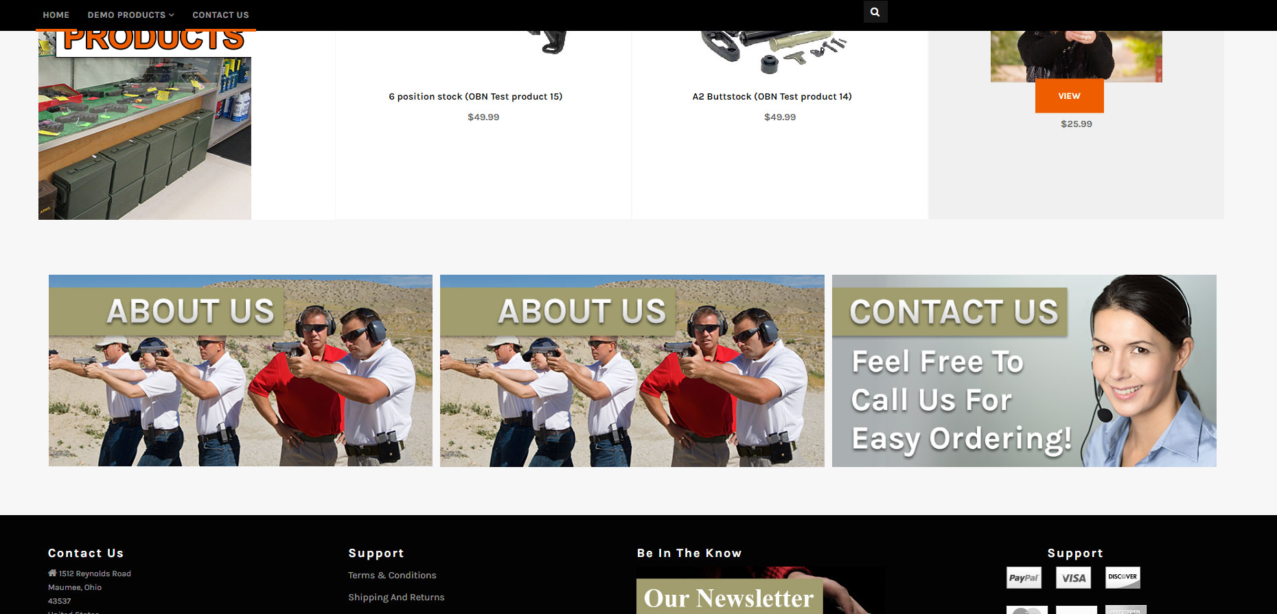
step 61: Lets focus on the first box and make this direct customers to the "About Us" information page. Step 62: After you have created a image for the first box, you will need to upload it and override the current one. 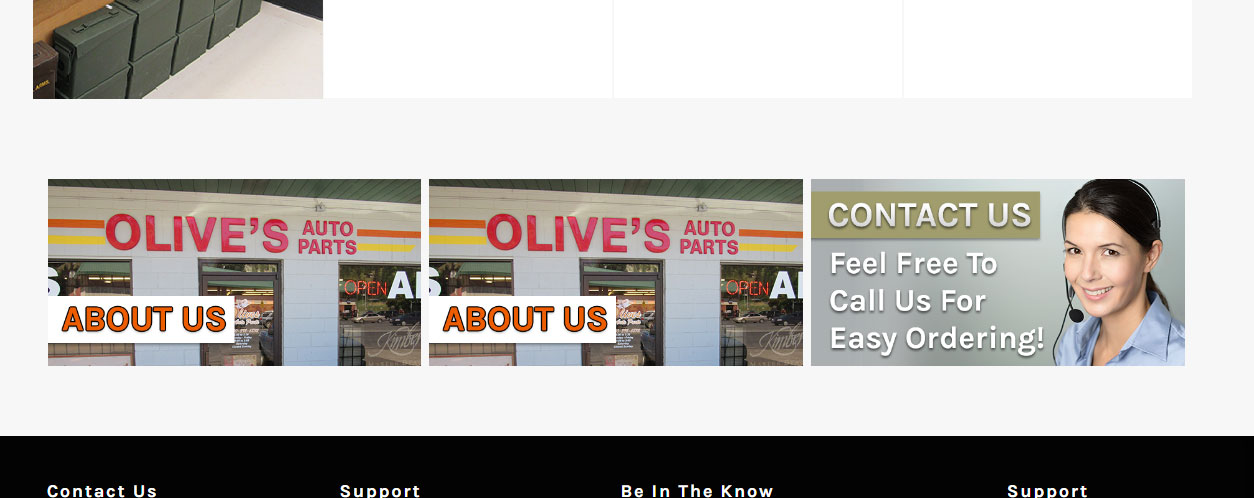
Step 63: Since the second box was copied from the first box, it carried over the same code and the links within it. So now we have two "About Us" images next to one another. Return to the "Define Mainpage" so we can make changes to the code. 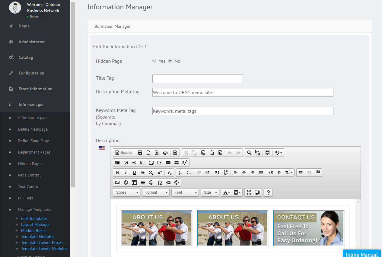
Step 64: We have not made the second image for the second box yet, but now that we are in the code again lets diable these links til we know what pages we are linking them to exactly. We also wanna disable the image for the second box since we don't what it to copy the first box and we don't know what we wanna put there yet. 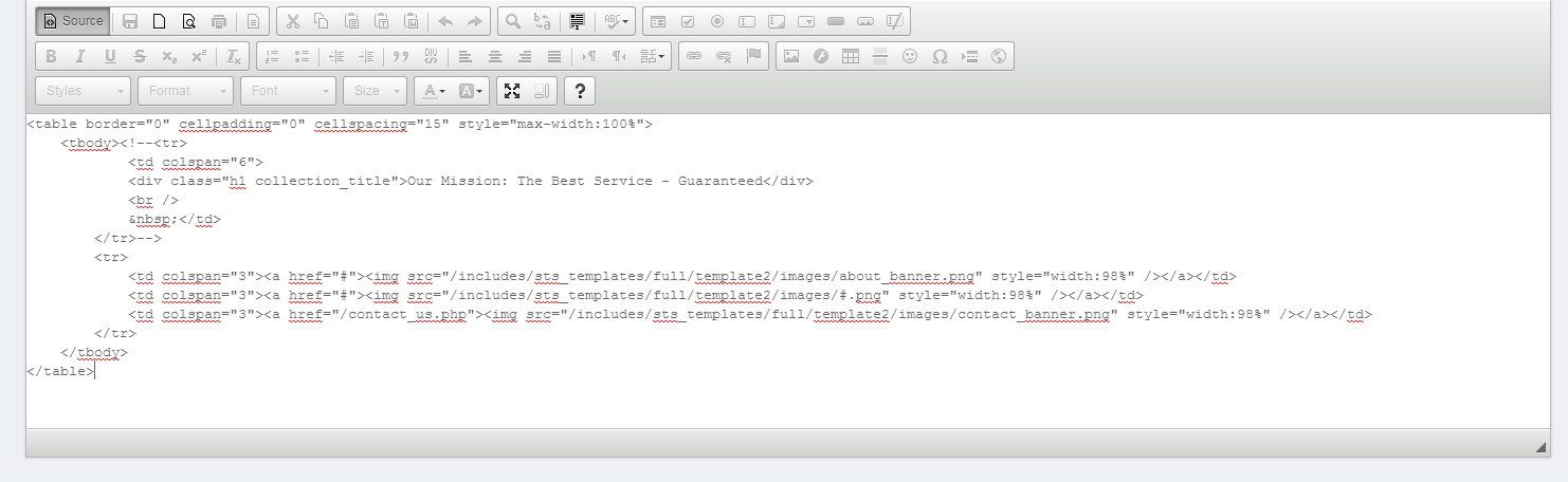
Step 65: As you can see in the image below, since we diabled the code by adding "#" and there is nothing calling to an image we now get a broken image icon which looks like this: 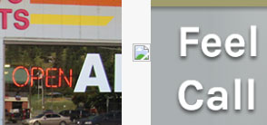
Step 66: Reopen Photoshop if it is not already open so we can create the image for the second box there. Step 67: Now that we have created the image for the next box, upload it. 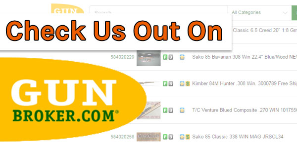
Step 68: After clicking the "Refresh" button on the browser, the broken image icon shows up instead of the new image we created. That is because we need to update the code again now that we know what we called this image and where it will direct customers and Website visitors. Step 69: Looking at the code in the "Define Mainpage" option located in the admin of your website we cna now linkt he image appropriately. Notice how we still haven't linked all of the images. Do not worry about that since we still have a third image to work with. After the third image, we will link all of them. 
Step 70: Once the code has been updated, the image in the second box should now appear. Hit the "Refresh" button on the browser to see if everything look correct before moving on to the last box. 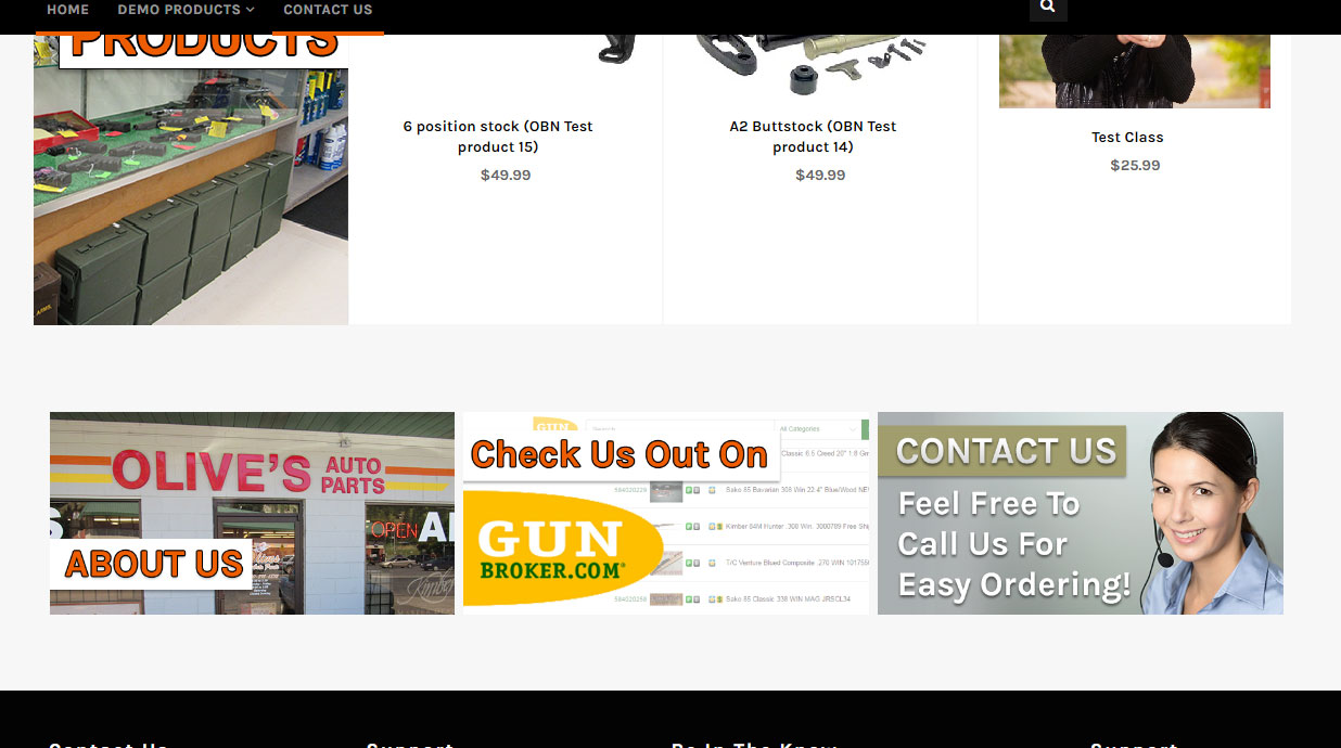
Step 71: Moving on to the last box with the last image in Main Content. So follow the steps that we did for the first two boxes to design and upload the image for the last box. 
Step 72: Here is how all three boxes should look. 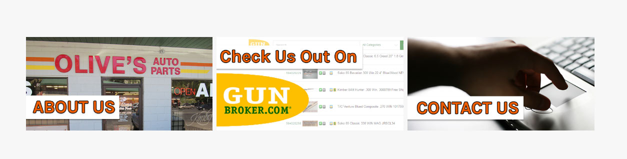
Step 73: Return to the code, and link each image by copying and pasting the urls. 
Step 74: With the code now updated, it is helpful to do a click through to make sure those link work for those boxes. Designing The FooterThe Footer is important because it generally carries all of the important information such as contact info, location, copyright, social media and other useful tools for your customers like site maps, etc. Step 75: Looking at the footer and determining what needs to be change. In the image below, for this example we will be changing ALL of the content. 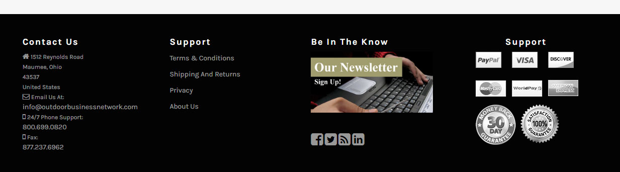
Step 76: Navigate back to "Info Manager" in the admin of your website. From there, scroll down and return to the "Edit Templates" option. Click it. Step 77:, You again will see a number of different files but the ones we want to focus on now will be the "Footer Box". There will be four of these (01, 02, 03, and 04). Click the first one. 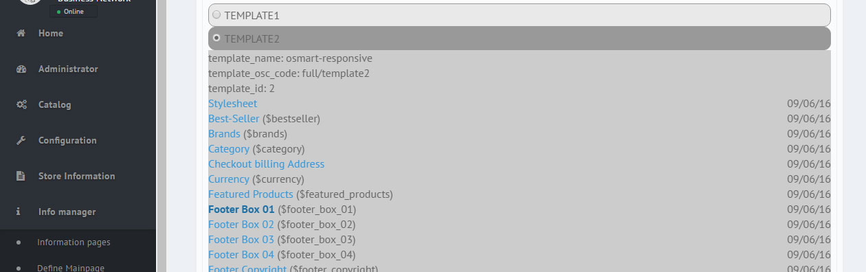
Step 78: You will see the code behind the first section of the footer. It should look something like this: 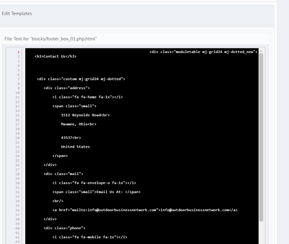
Step 79: This Footer has the business address and contact information. Edit this to match the information on the /contact_us.php page of the website. Step 80: Scroll down, there will be a button that reads "Update". Click it. Step 81: Hit the "Refresh" button again on the browser and lets see the updated Contact Us information in the footer. 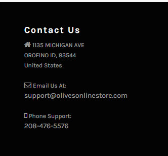
Step 82: Moving on to the second section of the footer. We can see here, there are two "Support" sections. This needs to be corrected when we edit the information in the second section. 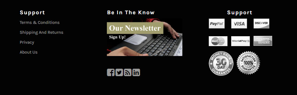
Step 83: Follow the same steps we used to change the information in the first section. Step 84: Click "Update". Step 85: We changed the "Support" to "Information" and updated the links. Hit Refresh again and it should now look like this. 
Step 86: Its time to use photoshop again, the third section has an image that links to the page for the newsletter. Step 87: Upload the image like before via file manager and return to your website. Click the refresh button and it now should look like this: 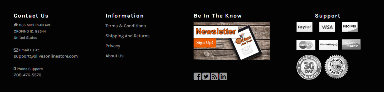
Step 88: Next, the last section will be "Support". Not much needed to change unless you feel you need to or customer requests. For this example, we will leave "Support" alone for now. Step 89: Go through and click all the links and make sure all the links work properly. Designing The Login/ Account PagesIt is important to not ignore the other pages such as the Login and Account pages since Customers are required to visit these pages. Step 90: From the main navigation, lets visit the Login page first. 
There are some green buttons that need to be changed. Step 91: The buttons can not be changed through CSS color wise, so we need to go into File Manager and locate where these buttons are being called from. Step 92: There will be a number of buttons, so after you are done changing the buttons for the Login page it is idea to go through and change all of the buttons to match. Step 93: Click Refresh on the browser you are using so you can see the changes. 
Step 94: This page isn't done yet, if you look there is green text. Any page you edit/change, make sure that they follow the concept and color scheme of the entire website. Use CSS and change the color so that it looks similiar to the image below: Step 95: After finding it in CSS, make sure to use a matching color from the color scheme. Click refresh and see the results. 
Step 96: Now we can move on to checking the Account page. If you click "My Account" from the main navigation you will notice it brings you back to the Login page. In ordert o have an account and see the Account page we must create an account. This needs to be done anyways so we can complete testing and test orders. For this step, get start with creating an account. Step 97: While creating this new account you may noticed pages like these: 
Do not freak out. Finding stuff like this is actually a good thing. Most of this can be fixed using CSS. Make sure to change the colors to find the color scheme. Step 98: Alright, so after modifying the CSS a little, we should have the following result: 
Step 99: Continue creating an Account. Remember, we need to test the entire process of not only creating an account but make sure things look correct from the customer side of things. Such as color scheme. Step 100: Success! We have created an account. However, look at the image below. See the green text? Time to go back to the CSS and make sure those colors match the color scheme. 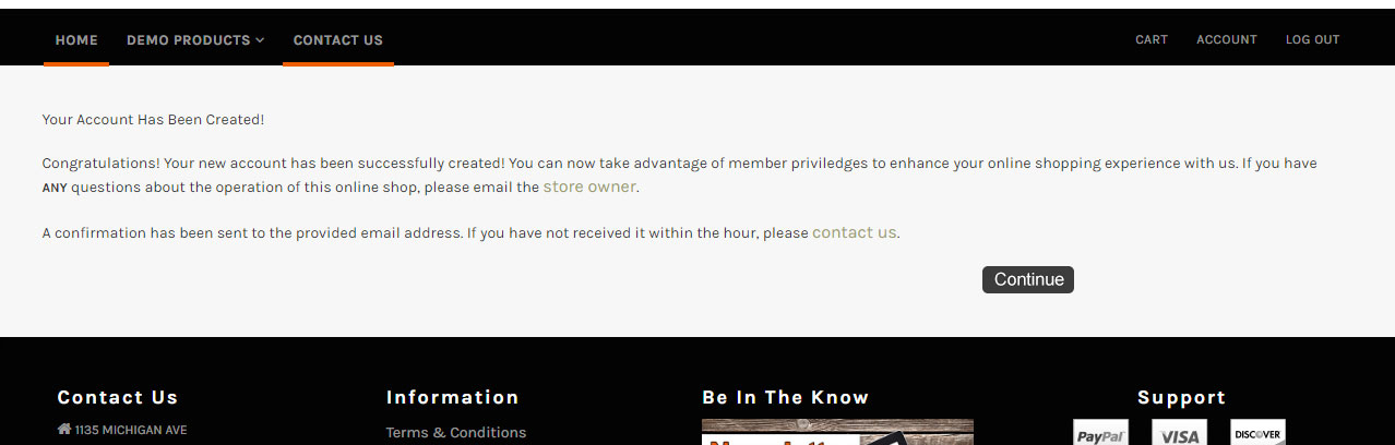
Step 101: The font for that page is now orange and matching the rest of the site. Now head over to the navigation above and click "My Account". Step 102: With this page (/account.php), make sure everything looks correct and that the colors for these links are the matching colors. Take time to click through each of these pages and make changes if needed. 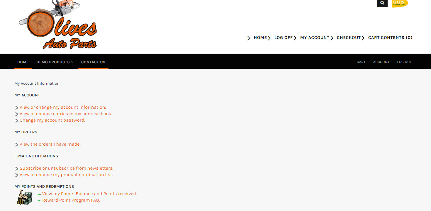
Step 103: For the remaining of this knowledge/testing the website you need to be logged in so you can see it from the customer's perspective and make changes where needed. Designing The Product Listing PageStep 104: The Product Listing page is the pages where products are listed after selecting a category. The key things here that should be focused on are the following:
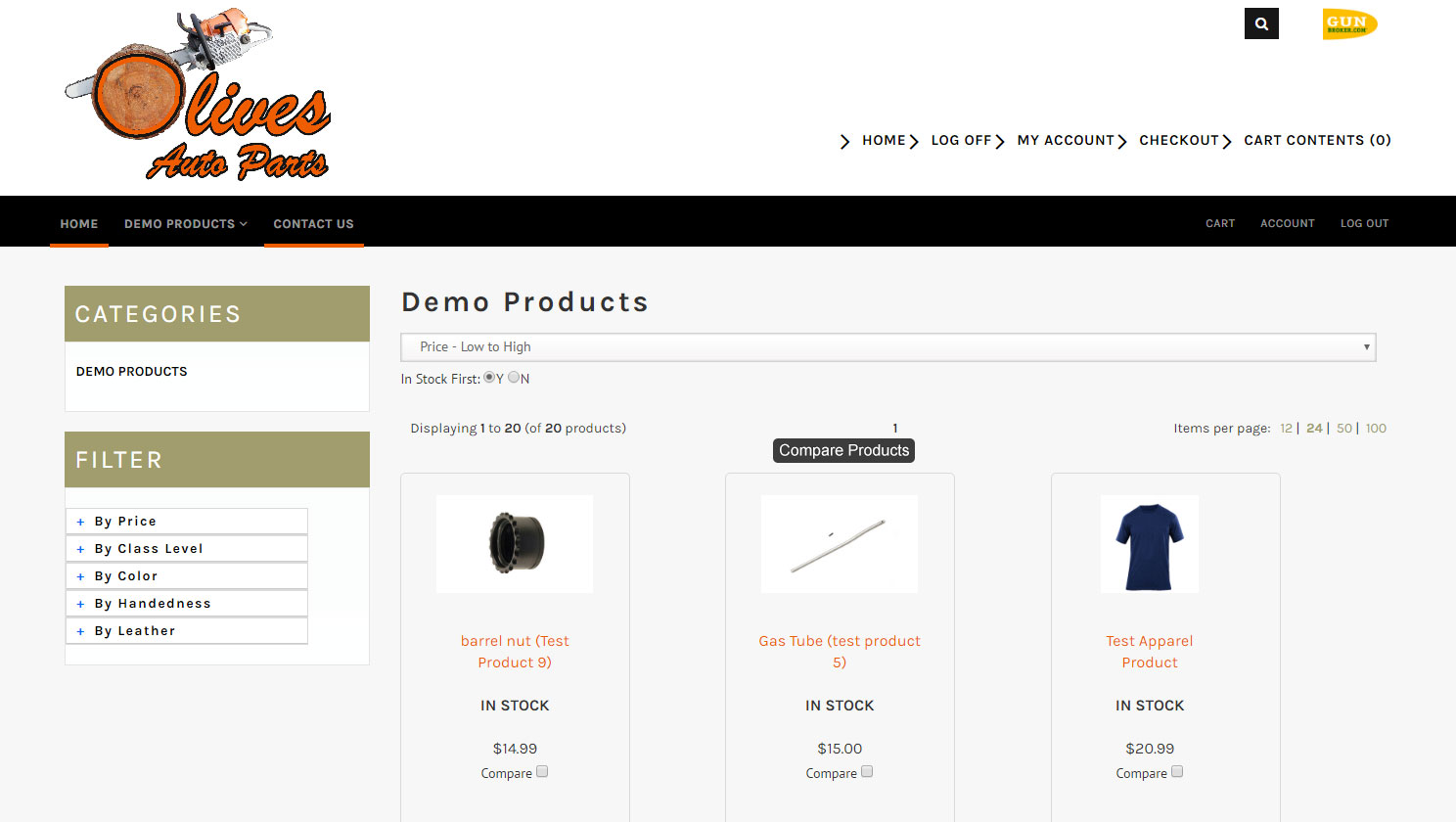
Step 105: Get famaliar with Product Listing Pages doing the knowledgebase linked below: Product Listing Pages Knowledgebase Step 106: Change colors to match the color scheme of your website. 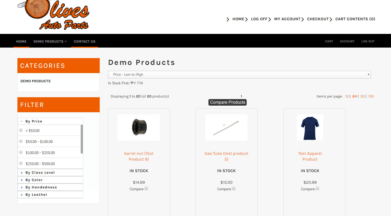
Step 107: Go through the check list mentioned in step 104. Testing this page out may take up some time but it is critcial that this page is responsive in mobile while functionally properly on a monitor screen. Designing The Product PageStep 108: Use that same check list for Product Listing Page. The Filer step can be ignored for this. Step 109: Look to see if colors are matching the color scheme. In the image below, they do not. Use CSS to match the colors. 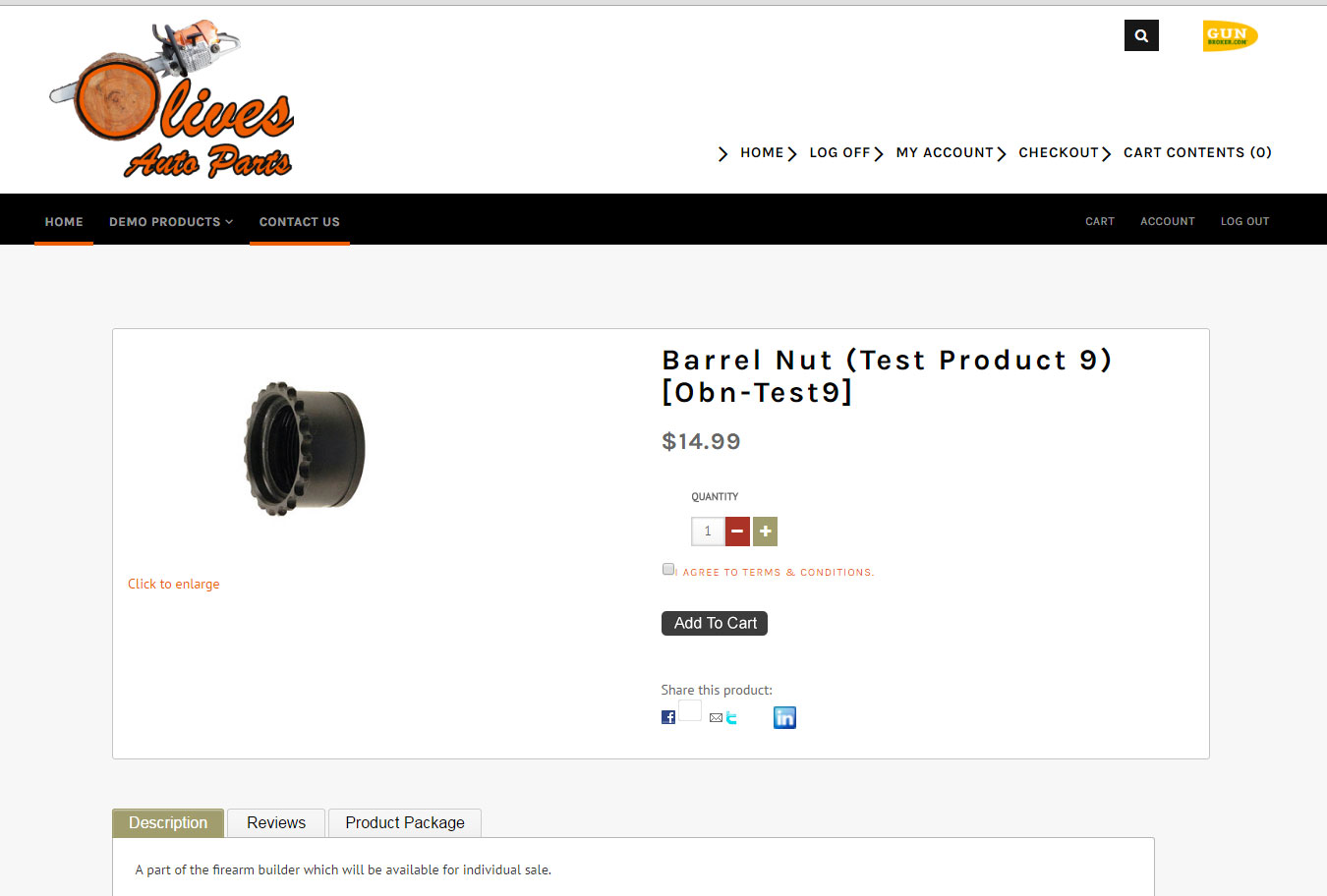
Step 110: With the colors now matching, use CSS to make sure everything lines up and nothing seems outof place. Should look similiar to the image below: 
Step 111: Test this page in mobile. This can be done by pulling it up on your phone. To do a complete test on different phones and versions of phones I recommend BrowserStack.com 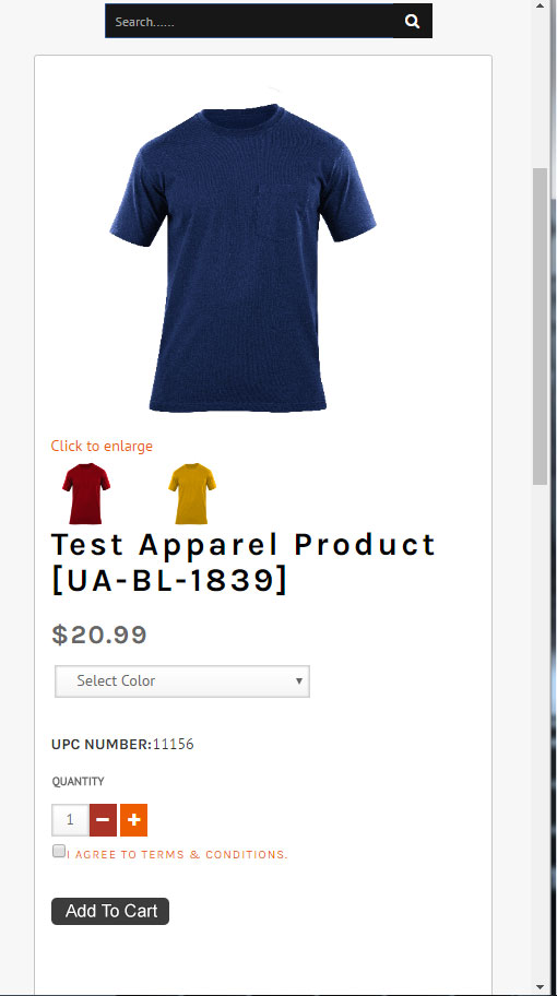
Step 112: make sure the "I AGREE TO TERMS AND CONDITIONS" checkbox is working correctly. This can be done by trying to click the "Add To Cart" button without clicking the box. See image below: 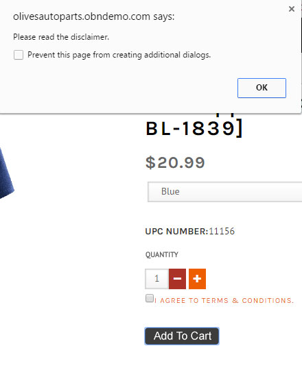
Designing The Shopping Cart PageThe Shopping Cart page (/shopping_cart.php) is the page just before you go through the Checkout process. Step 113: So right away we see there needs to be color changes. You will need to naviagation throughout your entire site to make sure that everything on your website looks correct and functions properly. It is better that you run into these problems than your customers or cilents. 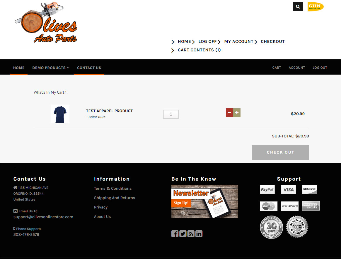
Step 114: Another helpful step, for changing all colors is if you are using Dreamweaver hold the control key and F letter key on your keyboard to pull up the following screen: 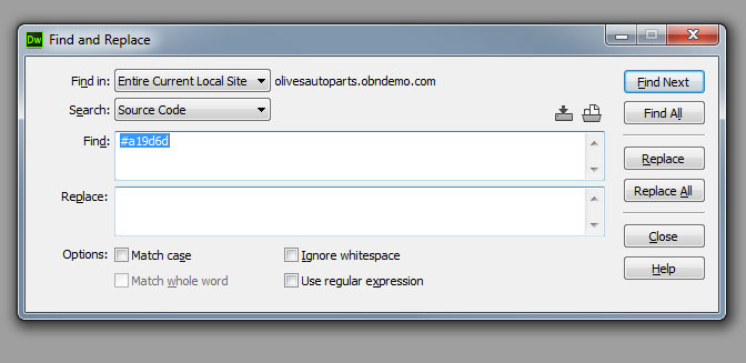
From this pop-up, you can search that one color and automatically replace it with the color choosen from the wbesite's color scheme. IF you don't wanna completely change all of the colors to the one color, you can just click "Find All" and that will pull up all of the codes that involve whatever keyword in that search. From there, you can go in and make edits or changes where needed. Step 115: Now with that colors corrected to match the color scheme of the website it is time to test the functionaly of this page. Click everything and check the responsiveness of the page as well. 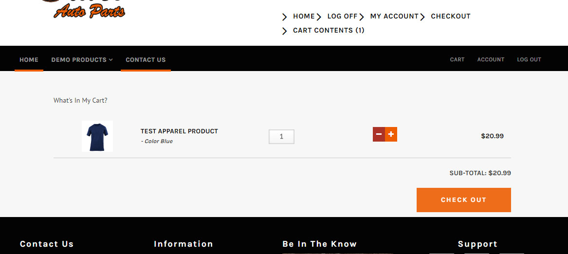
Designing The Checkout PageStep 116: The Checkout page, this whould have more than just one test to make sure this page is working like it should. From the Admin of the website you have options. You can chose the "Multi-Page Checkout" or the "One Page Checkout". Either way, it would be idea to get more familiar with each method by clicking the following knowldgebases: Multi-Page Checkout Knowledgebase Step 117: With the color changed mades, the rest of the site should now have the same color. Moving on to the checkout, we can see that the colors match now. IF they do not match, then continue checking the CSS and making changes accordingly. 
Step 118: Test this page in mobile. It needs to be responsive and needs to function correctly. The image below shows an example of what you should be looking out for. 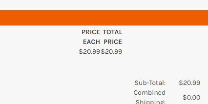
Step 119: After making more changes to the CSS, your end result should be this: 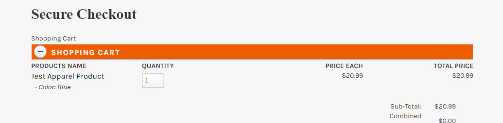
Step 120: After making sure it the page is responsive, scroll down to the very buttom and click "Confirm Order". Step 121: You should see a page that confirms the order has been placed and it should look like this. 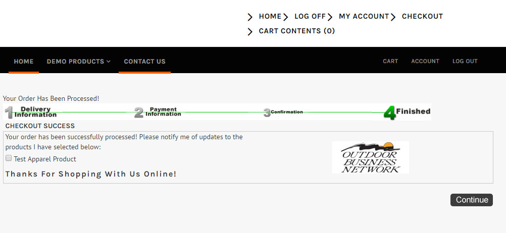
See how the Outdoor Business Network logo is showing up? That needs to be chanced to match the logo in the header. Step 122: After going back to change that image and uploading, click refresh to see if the image shows up correctly. According to the image below, it does. Now we can move on. 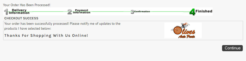
Step 123: Click "Continue". Step 124: Make sure the order goes through correctly. IF not, make the necessary changes. IF so, test this page as well with multiple orders trying different options. Turning Off Frontend CategoriesStep 125: We are not getting into the final steps to completing this website. These next steps will mainly focus on how the site looks in mobile. The final testing stages require us to see how the site will look with the actual porduct listings. For that, we need to turn off Frontend Categories. 
Information Pages!Step 126: Before we step into testing, we need to make sure all pages have content. This includes the Information pages we made earlier. Information Page Knowledgebase Mobile TestingAlright, so now we are in the testing steps of creating a website. Testing not only includes making sure the images are correct, the page functions but seeing how responsive it is in mobile. Everything needs to be checked and clicked through and seen from a customer perspective. If you hit a bump or see something out of place, chances are the customer will too and it can become furstrasting. It is recommend to return to that element and fix the code. Step 127: The first thing we need to test is the Header. Resize your screen or type the URL in your phone. The website in this knowledge currently looks like this: 
Step 128: Test the navigation. This should also be tested using your phone. It can also be helpful using browserstack.com. Step 129: Test the Log in/ My Account pages. Step 130: Return to the home page/index page and test the entire naviagation menu with the header menu. Step 131: Testing the slider. Does the slider function? Do the links work when you click the slider? Step 132: Featured Products. Do they align properly? Do the links work? Anything out of place like the price? Step 133: The footer. Should looking something like this.: 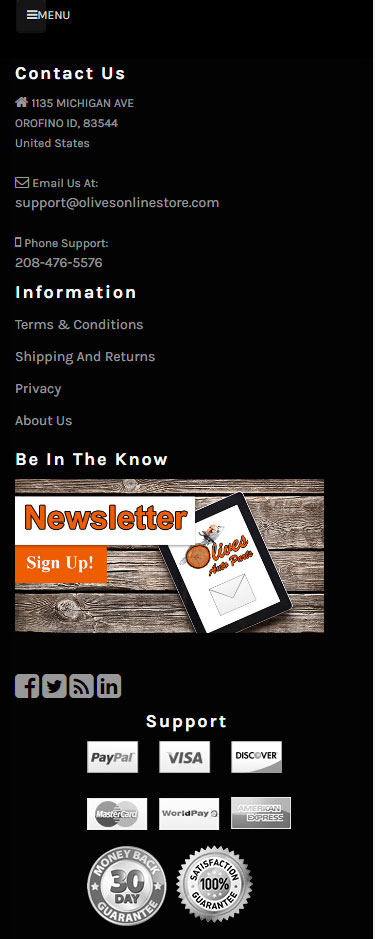
Step 134: Next, continue to the product listing page: 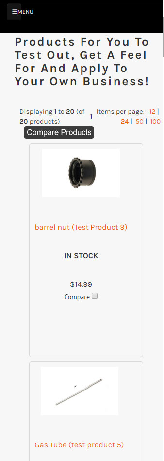
Step 135: Test the product page next: 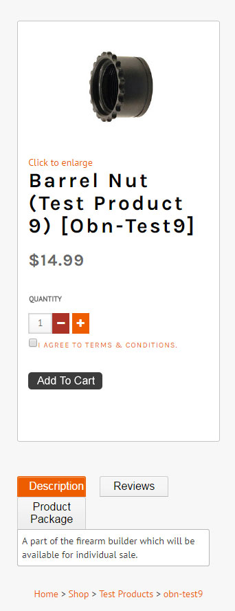
Step 136: Text the checkout prcoess and the checkout page. Again this needs to work 100% and function proplerly. Step 137: Test out the information pages. Step 138: Test this website in multiple browser repeating steps 127 through 137. Step 139: This step is optional. Have a second pair of eyes go through the website and see if they notice anything and get some friendly advice. Make changes as needed. Step 140: After getting a second set of eyes, work to make changes on the things that needed to be fixed. Turning on the CacheStep 141: Return to the Cache, located in the admin part of your website. Step 142: Set Cache to "True". Step 143: Click "Update". Launching The Website.Step 144: Update the existing ticket in our ticket system that the website has been fully tested and is completed. Step 145: Revisions. Step 146: After revisions have been finished, the ticket and website is moved to support and the website is launched with it's official url. So www.Yourwebsite.obndemo.com would now be www.Yourwebsite.com. This concludes the design process but a customer may always requests edits, changes, revisions and or updates later down the road after the initial step up/design.
Need help? Have questions or don't have the time? Be sure to give us a call at 800.699.0820. We are here to help. You can also bring up any issues by using our ticket system. Hope this tutorial was helpful. |
- 0 Users Found This Useful
